Weather Report – Final Edition 06102021 June 10, 2021
Posted by easterntiger in Uncategorized.add a comment
Let’s add two plus two…
First, blogging as a source of up-to-date information is on a steady decline.

Attention has shifted into a dramatically different direction.

It’s become much easier for information consumers to absorb their information on the go, away from the desk, riding in the car, or, simply in bits and pieces.
Therefore, I have evolved with the trends and initiated a podcast format. A Youtube video of the same subject will follow the release of each podcast, at a later date.
My son Edwin and I have been asked by a number of people to combine our cross-generational experiences, into a podcast format. This allows faster reaction of real-time events, and, reflections of ongoing parts of our upcoming series over time.
Edwin studied business at Florida A&M. He spent a decade in Asia, working first for a Chinese electronics company, Boaxiang Electric in Wenzhou, which sold millions of dollars of exports directly to Walmart for U. S. distribution. He also consulted with the company leadership in strategic planning, as well as their investment opportunities. He then enjoined with a family-owned precious gems business in Sri Lanka, creating a cryptocurrency company driven to place precious gems on the cryptocurrency blockchain. Sri Lanka is one of the leading precious gems producers on the globe. Imagine buying a fraction of a $250,000 ruby for your investment portfolio, and, reselling it back to the blockchain on your own schedule, which has never been possible. Also, gems can now be graded on a scale, like diamonds have always been. That’s also never been possible before, for gems. That is a great business model, but, will take longer to evolve than planned. Nevertheless, this is somewhat like purchasing a fraction of an entire bitcoin, which is now routine. He is now back in the states working with a large southeastern city government on their blockchain and cryptocurrency policies.

And, for the other 2, and, on to the more relevant, longer term, financial landscape…….
*The Federal Reserve is now in its 13th year of market ‘stimulus’. This was supposed to be temporary. This plan is actually going very badly.
*The intended ‘quantitative easing’ initiated by past Fed chiefs Ben Barnanke (2006-2014), and, Janet Yellen (2014-2018) as temporary support mechanisms have now become permanent. As if the 125 years worth of Fed balance sheet growth from 2009-14 wasn’t enough, another 75 years worth was added just in 2020. This crack addiction is now in extended overtime. The Fed has backed itself into a corner that they’re simply too frightened to get out of, not prepared to risk the traumatic effect they saw when they followed their original plan, only to see their withdrawal of support collapse the markets late in 2018.
*Our financial markets, exactly like those in Japan and Europe, are in a permanent state of elevation, on steroids, as the ‘wealth effect’ is now a full-time family member.

*Measuring and monitoring stock indexes is no longer based upon fundamental criteria. My technical analysis has not been effective for quite some time. Accordingly, many money managers and hedge funds have been dissolved in the past decade for this very reason. https://www.opalesque.com/677016/Opalesque_Roundup_More_than_4000_hedge_funds_have701.html
In the week ending January 3rd 2020, a study said that the hedge funds industry is now on track to record more closures than launches for a fifth straight year, a blow to a market that once minted millionaires at a heady pace. More than 4,000 funds have been liquidated in the past five years, according to data compiled by Hedge Fund Research Inc.
Investors are pulling money at an accelerated pace as high fees and mediocre returns send them searching for yield elsewhere. They’ve yanked $81.5 billion this year through November, more than twice the amount for the whole of 2018, according to eVestment data.
Total assets under control by hedge funds appear to have hit a plateau of near $3 trillion a few years ago, which implies the industry “isn’t going away” but is “definitely not growing,” Bloomberg’s Katherine Burton reported.
Meanwhile, the average performance fee for North American hedge funds dropped almost 2 percentage points between 2018 and 2019, from 16.24 percent to 14.81 percent. That’s down from 18.39 percent in 2009, according to Eurekahedge.
*This has rendered the tools upon which I rely as useless. There are no ‘overbought’ or ‘oversold’ conditions.

Not knowing that we have some of the most over-valued markets in the world doesn’t make that fact go away. They are literally robbing future returns and stacking them into today’s returns, just to keep everyone happy.
This table is a projection of annual returns over the next 10 years.
WE ARE PRESENTLY 30% ABOVE THE HIGHS OF THE DOT COM BUBBLE!

You can have your returns now, and, none later. Or, you have have lower returns now, and, better returns later. You can’t have good returns now, and, good returns later.
However, complacency aside, taking any suggestion that your portfolios are on a permanent auto-pilot for appreciation would be a mistake.

Because, although these ‘gains’ look good on a table, or, on paper, the reality is that the market stimulus is just enough to create continuous appearance (wealth EFFECT) of a steady climb in portfolios, when actually…

….real returns, after inflation, are half or less than they appear to be.
The total return certainly looks better 18 years later, but the real (inflation-adjusted) purchasing power of that $1,000 is currently 1,539 dollars above break-even, a real compounded annual return of 4.49%.
Meanwhile, other, more lucrative returns can only be found by turning your eyes in a different direction. Unfortunately, those vehicles offered to us, are seemingly viewed as our best opportunity. That’s as much of an illusion as a dollar, that doesn’t appear lose value every year.

It’s been a great honor and a pleasure over the past decade to try my best to connect the dots on this bewildering environment that’s been forced upon us. I’ll miss some of the exchanges and positive feedback. This is #82!!
But, for now, please join us as we turn the page, for the newer and broader opportunities ahead of us.
If you subscribe, you’ll be notified as soon as we produce another podcast or video.
Reggie
Weather Report 03052020 March 5, 2020
Posted by easterntiger in bonds, economic history, economy, financial, markets, stocks.Tags: bonds, central banks, Economic Cycles, economic theory, f fund, Federal Open Market Operations, S&P 500
add a comment
Coronavirus Pops The Bubble!!!
Everything since the 12/04/18 report, shown in the second column below, has been under the heavy influence by reversing the balance sheet reduction (the FRED chart), and, more significantly, DAILY influence of the actions by the Federal Reserve board, to keep the ‘wealth effect’ active, and, to keep consumer confidence as high as possible.

By DAILY influences, I mean the nightly ‘repo’ operations. These are the daily liquidity injections the New York Fed provides in overnight repo markets to keep overnight rates artificially suppressed and to meet rising demand of banks for liquidity. The temporary liquidity crisis has apparently become permanent.
You can actually see these daily operations right here. (That’s $87B today!!!)
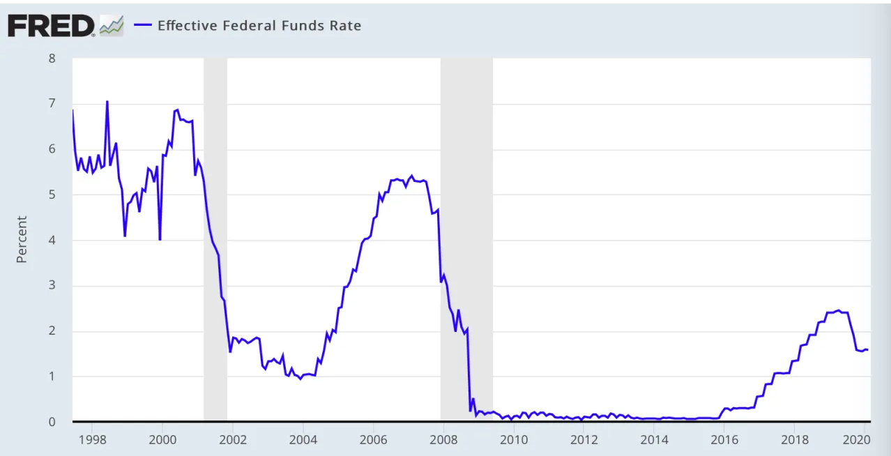 The Federal Reserve has also cut from the 2.5 point ceiling of the Fed discount rate in the past year. This leaves them with barely more than half of that, 1.5 points, with which to use, in conventional sense, in the event of an actual crisis in the future.
So, they’ve used more of their Fed discount rate ‘ammunition’ to influence events in so-called, relatively ‘good’ economic conditions. This does not bode well for future, possibly catastrophic events that require future Fed intervention.
It was only a matter of time before even these superhuman efforts would encounter a pocket of major turbulence that was beyond the control of central bankers.
This is often referred to as a ‘black swan’ event, one that comes as a complete surprise.
How much of a surprise do you need when the signals are clearly evident around the globe, even before the ‘black swan’ event?
For those who want to delve into the details of the relationships between (1) the coronavirus, (2) the global stock markets, and, (3) the record lows in the 10-year treasury note (bonds), take a look at this two-minute video from Bloomberg.
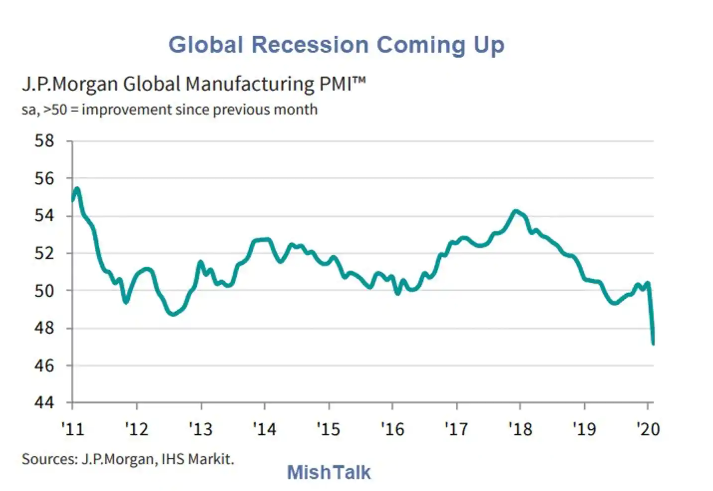
Global manufacturing suffered its steepest contraction in over a decade as COVID-19 outbreak hits supply chains and demand according to Markit.
Six Key Points
- Global Manufacturing PMI slumped to 47.2
- Survey-record contraction in China; rest of the world stagnates on average
- Global trade falls at fastest pace since April 2009
- Global Manufacturing Decline Steepest Since 2009
- Manufacturing employment declined for the third successive month in February, with the rate of job losses the fastest since August 2009.
- Purchasing activity declined to the greatest extent in the series history (which started in October 2009)
The J .P.Morgan Global Manufacturing PMI – a composite index produced by J.P.Morgan and IHS Markit in association with ISM and IFPSM – fell to 47.2 in February, down from 50.4 in January and to its lowest level since May 2009. Manufacturing production and new orders registered their sharpest declines since April 2009.
The downturns in both were quickest in China, where output and new business fell at survey-record rates. Of the 31 nations for which February data were available, 15 registered a contraction of output, including China, Japan, Germany, France, Italy, Taiwan, South Korea and Australia. The US, the UK, Canada, Mexico, India and Brazil were some of the larger countries to experience output growth.
So, clearly, this is not just about the coronavirus.
The virus lit the fuse that was waiting to be lit.
Signs of Completing the Market Top
Extreme Volatility
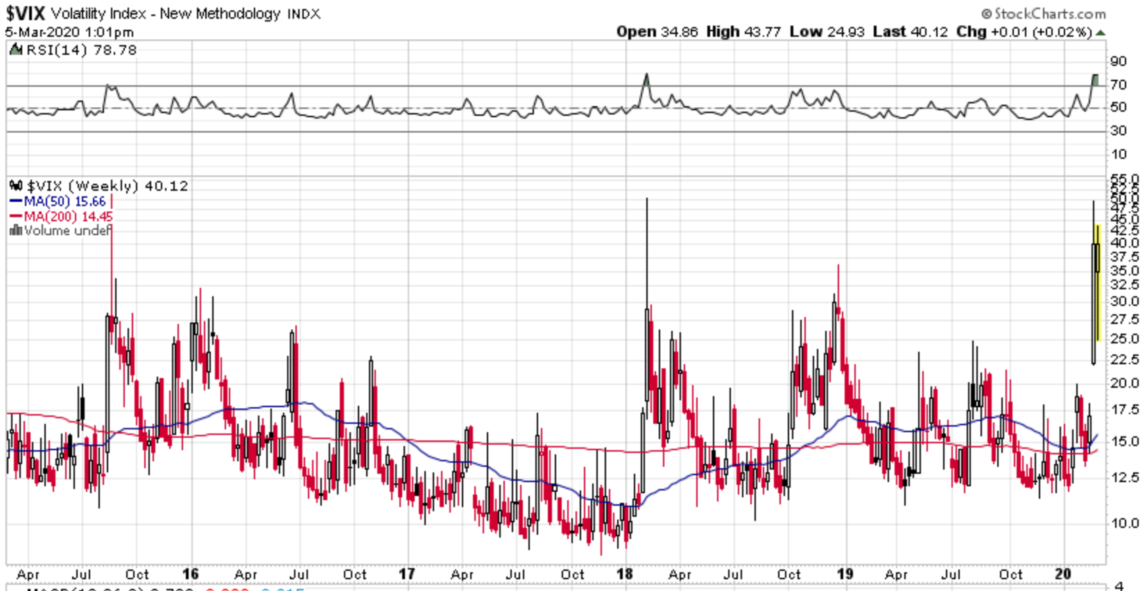
We are seeing daily 3% and 4% swings in the market indexes. This is normal, showing on the right of this volatility chart, in the context of ‘topping’ or ‘bottoming’ of financial markets.
Of course, this is taking place in accordance with a ‘top’.
Even Bigger Picture
Historically Significant Corrections
91% of the price appreciation for the classic portfolio over the past 90 years came from just the 22 years between 1984 and 2007.
Large capital inflows from boomers, falling interest rates (from 19% to zero) made this happen.
Gains of the magnitude in our recent memories are NOT going to be repeated!!
Only once in 134 years has the New York Stock Exchange ever experienced a breathtaking selloff on the order of our 9-day, 16% decline and still remained in a bull market.
That was in May 1915 when German U-boats sunk the ocean liner Lusitania killing 1189 civilians on board.
The difference is that the selloff in 1915 occurred at the start of the World War I bull market which had just begun in December 1914. Since our decline has occurred in an entirely different portion of the business cycle after a 12-year bull market, we can dismiss this precedent as being relevant to our current situation.
This means that of the 118 bull market corrections in history, none have acted like this one! So by extension, this must be viewed through the lens of being a 1st leg down in a bear market.
Looking at the bear side of the equation, our decline is reminiscent of only a handful of bear markets…1929, 1933, 1987 and 2000. These are some of the most profound turning points in U.S. financial history. The 1929 and 1987 markets experienced crashes of 45% and 37%. The 2000 top was followed by a 78% decline in the Nasdaq 100. And 1933 was a post Great Depression top.
A Refocus On The Bigger Picture
The simplistic notion is that there has been a ton of money made in the markets in the past decade or so.
Here is what creates that notion.
 From the blue line on the right, $2799 first appears to be a great gain on $1000 since the year 2000. Those are known as ‘nominal’ gains, not adjusted for inflation.
Until you recognize that you can’t buy anything in 2020 at 2000 prices.
So, after inflation, that $1000 is actually $1851, the red line on the right. Those are ‘real’ gains, adjusted for inflation.
So, why do we hear so much about 300% gains for the past decade?
That’s only when $2799 (nominal), or, $1851 (real), are measured from the BOTTOM of losing 50% from the initial $1000 back in 2000.
Much more risk is on the way!
Weather Report 081519 August 16, 2019
Posted by easterntiger in bonds, economic history, economy, financial, markets, stocks.Tags: bonds, central banks, Economic Cycles, economic theory, f fund, Federal Reserve, interest rates, S&P 500, treasury note, wilshire 5000 index
add a comment
While it might appear somewhat odd for the first report of the year to appear this late in the year, I ask that you recognize that it’s relative market action between reports that determines updates, not the calendar intervals in between reports.
To summarize the net changes in the key market indexes of our interest in the past 18 months, I have tracked specific market indexes to the dates of my last 4 reports, and, included the report at of August 14, and, the average of all changes in that time. The results might surprise you.

This proves that, in spite of hundreds of days in total market action, many days of positive and negative swings of all magnitudes, the net changes are almost negligible. Accounting for average inflation, the only position that would have paid you best would have been in the bond market, or, in our case, the F fund. Although the F fund slightly under-performed the C fund since February ’18, the amount of risk incurred in the C fund was not worth the minimal gain between the two.
Now that the equity markets appear to be confirming their final topping processes, this pattern should continue to favor the F fund more substantially,.
We’ve hit a wall here. Markets. Economy. Technicals. Valuations. All appear at a key crossroads here.
We’ve continued to be pulled in a tug-of-war, between trade wars, 20% correction in between, Federal Reserve ‘loosening’ from their ‘tightening in response, slowing growth data, inverted bond yield curves, political volatility, deficit and debt expansion, stock buybacks, etc., etc. All the big themes that have dominated the landscape in recent memory, they all have led us to here: Record market highs and high complacency into a historic Fed meeting where once again a new easing cycle begins.
Like flies drawn to a light, investors habitually ignore everything that may be construed as negative as the market’s primary price motivations. Meanwhile, the Fed, Bank of Japan, European Central Bank, are all once again embarking on global easing cycles, cutting rates, from the lowest bound tightening cycle ever. Many central banks such as the BOJ and ECB have never normalized. The Fed was barely raising rates before capitulating once again to macro and market reality.
Is there a natural wall beyond which bubbles cannot go before they revert back to a more natural state of valuation? It’s a serious question especially looking at the structural context of the last few bubbles. The biggest bubbles in our lifetimes were the 2000 tech bubble, the 2007 real estate bubble and the monstrosity we are witnessing now, the central bank, cheap money bubble.
All 3 have done something unique. They have vastly accelerated asset prices above their historic track record. In 2000 and 2007 these bubbles moved stock markets wildly above the mean and investors got punished badly. 
The next two charts, long-term and short-term, show total market value compared to GDP. Look at it as if housing prices continuing to accelerate, as in a bubble, but, at some point, running into a wall, because, as always, housing prices can’t outrun the incomes it takes to pay for them. Markets can’t continue to outrun the purchasing power of the consumers and corporations powering the companies comprising the shares of those companies. Even when central banks, hedge funds, etc., get involved purchasing shares by any direct or indirect means, value is value, and, expensive is still expensive.
Peaks of 147% and 137% respectively. Now this bubble has arrived in full vengeance on the heels of $20 trillion in central bank intervention, a global collapse in bond yields.

Now look closely what just happened in the past 18 months:

As my table at the top shows, little or now progress has been made since February ’18, the first peak. Meanwhile, the downside risks continue to increase, with the 20% losses during the 4th quarter. I have emphasized ‘poor risk to reward’ numerous times in the past 2 years.
We keep hitting the same wall. January 2018 nearly 150% market cap to GDP and stocks got punished with a 10% correction.
Last September/October we hit a slightly lower high around 147% and stocks got hit with a 20% correction.
Now in July we hit 145%, another slightly lower high, and stocks have begun selling off again.
Is that it? Is that the valuation wall? How far and for how long can stock markets stay this far disconnected from the underlying size of the economy? All of history says: Not for very long.
What has all this produced? For one, the slowest recovery on record, but also the longest expansion. But this expansion has come at a very steep price as artificial low rates have led to massive record debt expansion, $250 trillion in global debt:

To be buying stocks here based on the Fed promises is to believe that central banks can maintain asset values above the underlying size of the economy at a historically unsustained level especially in a period of slowing growth.
Following the period of the largest global central bank intervention on record (2016-2017) US tax cuts were promised to deliver 4% growth:
“With the tax plan, we’re going to easily see 4 percent growth next year” – National Economic Council director Gary Cohn December 2017
Gary was of course not the only one, Kudlow, Trump, Ryan, all the pushers behind the big tax cut were promising the moon. None of that came to fruition.
Why were stock markets appearing to be holding on to strength?
TAX CUTS. Corporations did not fulfill their promises to expand, hire, and invest. Their tax rewards went directly to another year of stock buybacks.

Reality: We didn’t even get 3% growth. US GDP for 2018 was just revised down to 2.9%. Second quarter 2019 GDP has just slowed down to 2.1% and the entire globe is struggling with growth across the board. “Things are getting worse and worse” Mario Draghi head of the ECB said recently.

And, from Germany we find that not only have they already entered a recession, with two consecutive quarters of negative growth, but, 2020 forecasts are also lower. The UK has entered one quarter of negative growth, halfway into recession.
So, why do we hear so much about the strength of the job market, with 50-year lows in unemployment rate, 18-year highs in consumer confidence? Of course, it’s good news, for now.

Unfortunately, these market highs, valuation highs, and, bond market turns to lower yields, all at once, all signal the end of the business cycle.
-Low unemployment bottoms, and, unemployment rises
-High bond yields peak, and, turn to lower rates, signaling economic weakness
-High market valuations also peak, and, also turn lower as stock markets fall, signalling a shift in corporate and consumer sentiment
-Consumer confidence parallels stock markets, and, reverse lower right along with market levels.

The yield curves are what has the Fed freaking out and cutting. The problem of course is this: In 2001 the Fed had to cut by 525 bp. In 2007 they had to cut by 500 bp. This cycle they’re starting from less than half of what was available in 2001 and 2007, from 225bp. Never before has stock market capitalization versus the economy been this high with the Fed having such little ammunition.
There are historical examples where “insurance” rate cuts helped delay the inevitable, notably 1998 and the 1980s. But the 1980s also had a market crash and the 1998 example resulted in the tech bubble and subsequent crash making both examples not exactly inspiring examples of success. Is this the end game, blow a massive market bubble?
With a stock market running at a capitalization of 145% of GDP with no history of being able to sustain above these levels, is this the end game here? Blow an even bigger bubble? And that’s the issue with the insurance cut last month being successful here: Markets are already in historically extended valuation territory relative to the size of the economy.
Even cutting rates to zero in some European countries hasn’t been the effective solution. There are now nearly $16 trillion in negative rate instruments already in play globally.

Banks are so desperate for creating something from nothing, it now costs you interest/the bank now charges you for funds kept on balance. The idea is for you to keep the money out of the bank, and, to circulate it in the economy. This is the first time in 3,000 years of known interest rate history that this has occurred.

Are we next?
Buyers beware.
Weather Report Alert 12042018 December 4, 2018
Posted by easterntiger in bonds, economy, financial, markets, stocks.Tags: bonds, Economic Cycles, Economic History
add a comment
At the moment, the equity markets are severely weakening, as the bond markets are pricing in lower rates.

This is a combination of three primary and possibly significant reasons for today’s near panic conditions:
1 – STOCKS YESTERDAY!
Stocks rose on Wall Street Monday after President Trump and President Xi Jinping agreed to a temporary truce in the trade war between the United States and China.
The S&P 500-stock index climbed 1.1 percent, notching its fifth gain in the last six trading sessions. Major Asian and European equity markets also posted solid increases.
A section of the U.S. Treasuries yield curve just inverted for the first time in more than a decade.
Today, a smaller inversion between the 5- and 2-year yields occurred. This is the second in two days.
The spread between 3- and 5-year yields fell to negative 1.4 basis points Monday, dropping below zero for the first time since 2007, and the 2- to 5-year gap soon followed. The 2- to 10-year is more closely watched as a potential indicator of pending recessions. But Monday’s move could be the first signal that the market is putting the Federal Reserve on notice that the end of its tightening cycle is approaching.
While the yields on shorter-maturities fell on Tuesday during Asian hours, the spread between 3-, 5-year yields remained stable. Longer-maturity bonds rallied sharply, flattening the long-end of the yield curve. The U.S. 10-year slipped another 3 basis points to 2.94 percent, dropping below the 200-day moving average for the first time this year.
Although the inversion between the 2-year note and the 10-year note is considered to be the ‘classic’ signal, which has not yet occurred, the fact that none of these notes have inverted in over 7 years is still a significant event.
3 – Politically, release of some of the sentencing conditions for former National Security Advisor Mike Flynn indicates the acceleration of approaching political uncertainty.
Weather Report 10232018 October 23, 2018
Posted by easterntiger in economic history, economy, financial, markets, stocks.Tags: bonds, central banks, Economic Cycles, Economic History, economic theory, f fund, Financial Trends, interest rates, Markets, S&P 500, stock market, stock market index, stocks, treasury note
add a comment
I don’t find it surprising that even after nearly 7 months since my last post, nearly every word in every section is still applicable.
I had deliberately declined interim updates, for the distinct purpose of waiting to see if the markets would find ways to either continue to break and exceed all-time highs, or, whether they would fail these highs and return to a weakening status. There was no clear answer until the past three weeks.
The big picture, Price/Earnings Ratio (P/E), had only declined from 33.6 to 31.8 in March, and is now only down to 31.1, making this still the 3rd most expensive market in the past 90 years, down only slightly from the 2nd most expensive earlier this year. For any historians, today also marks the anniversary of the start of the Crash of 1929.
 On February 9th, the S&P500 closed at 2619.55.
On March 26th, it was at 2619.55
On May 29, it was as 2689.86.
On July 2nd, it was 2726.71
It is currently at 2729.65.
All year long, slight gains, at extremely high risk.
Until today, the market breakdowns had partially set some limits to their losses. The standard line of demarcation for the ‘bull/bear’ markets is the 200 day moving average.
The lowest line on each chart, also, the red line, denotes the 200 day moving average.
Since the last report:
The Dow Jones Industrial Average since last report, is up 4.66%; only 1.06% YTD, after being up as much as 8.5% for the year. It has broken the 200-day moving average on October 11th, and, again today.
 The Nasdaq Composite Average since last report is up +4.95%, YTD is +7.05%, after being up as much as +19.8% for the year. It has broken the 200-day moving average on October 10th, and, again today.
The Nasdaq 100 Average is up +7.82% since last report, YTD is +10.24%, after being up as much as +17.2%. It has broken the 200-day moving average on October 11th, and, again today.
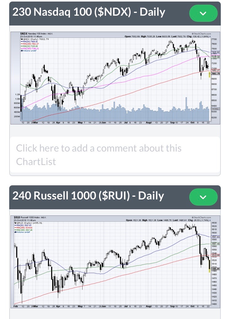 The Russell 1000 Average is up +3.64% since last report, YTD is only +1.37%, after being up as much as +9.6% for the year. It has broken the 200-day moving average on October 11th, yesterday, and, again, today.
The New York Composite Average, containing over 4000 stocks, is down -0.94% since the last report, and, down -4.67% YTD, after being up as much as +6.5% for the year. It has broken the 200-day moving since on October 9th, and, has never recovered since.
 The S&P 500 Average is up +4.0% since the last report, up only +1.67% YTD, after being up as much as +9.6% for the year. It broke the 200-day moving average on October 11th, and, has spent 6 of the past 8 days below that average.
The Russell 2000 Average is up +0.64% since last report, down -0.86% YTD, after being up as much as +13.2% for the year. It has broken the 200-day moving average on October 10th, and, has not recovered since.
 The Russell 3000 Average is up +3.47% since last report, and, up only +1.24% YTD, after being up as much as +9.8% for the year. It has broken the 200-day moving average on October 10th, and, has spent 6 of the past 8 days below it since.
The S&P 400 MidCap Average is down -0.67% since last report, down -3.28% YTD, after being up as much as +7.8% for the year. It has broken the 200-day moving average on October 10th, and, has not recovered since.
 The S&P 400 MidCap Average is up +2.64% since last report, up only +1.51% YTD, after being up as much as +17.2% for the year. It has broken the 200-day moving average on October 10th, and, has not recovered since.
This reports only exception to the March report is for the F Fund, which has had some negative pressure from rising interest rates, but, all in all, has only fluctuated in a small range between +1.0% and -1.2%. This is not acceptable performance over a medium to long range time span. It has served mainly as a hedge for risk, awaiting on the market to make some big, long-term, lower risk, decisions. It’s taken quite a while to do that. However, this small amount of negative/flat performance is the old ‘eat well or sleep well – choose one’ scenario. Upside performance in the other indexes has been slow, temporary, and, risky, while, simultaneously, exposing us all to rapid downdrafts that don’t allow for much complacency.
Bond interest rates and stock market indexes frequently make their highs together. So, it’s not surprising that the latest increases in interest rates have come near the timings of stock market highs.
While we’ll hear many suggest that higher interest rates are in the offing, leading to lower F Fund performance, in the shorter-to-medium term, renewed, downward interest rate pressures might be expected as many signs of economic weakness continues to emerge, including,
– a 6 consecutive month of U. S. existing home sales,
-the Bullish Percent Index, an indicator of ‘buy signals’ for major stock funds, reaching a low of 35.20 today, a level that ties with a low of 6 months ago, and only seen for a second time since early 2016. This indicates no interest in buying stocks at these levels, but, rather, a signal for likely further selling.
-home prices peaking in metropolitan areas around the world,
-the rising risks, due to interest rates, from holding stock portfolios,
-double-digit losses in markets around the world all year, from European to Asian markets. Many have suggested that the direction between those markets following us back up, or, our following them down would be known soon. I believe that the answer is now apparent.
-a currently ‘neutral’ liquidity flow from the three world central banks, the European Central Bank, the Federal Reserve, and, the Bank of Japan, followed soon by, the first NEGATIVE liquidity flow in over TEN YEARS, and, continuing to trend NEGATIVE into 2020!! This has been a major source of support for institutional traders, and, a major source of support for world markets since 2009.
Take no comfort in recent announcements of strong economic growth, based upon the Q2 GDP of 4.1%. This ‘sugar high’ is still lower than 4 other quarterly highs in the past 6 years, when annual GDP was still closer to 2.5%; like last year’s 2.2% annual figure. This ‘sugar high’ was ‘sweetened’ by a one-time rush of exports of oil, steel, aluminum, corn, and soybeans, all timed to beat the oncoming tariff deadlines for late June/early July. The next GDP release is scheduled at the end of the month. That should be without that artificial Q2 pressure, and, will serve as a more true reflection of growth ahead, until the final GDP figure for the year is released in late January.
Weather Report Alert 03282018 March 28, 2018
Posted by easterntiger in economic history, economy, financial, markets, stocks.Tags: Economic Cycles, Economic History, economic theory, f fund, Federal Open Market Operations, interest rates, S&P 500, treasury note
add a comment
Just over six weeks have transpired since the period from the last report on February 9th when the S&P500 closed at 2619.55. On Tuesday, it closed at 2612.62, a total change of -7 points over that six week span.
In this same time frame, the ‘Big Picture’ of the Shiller Price/Earnings Ratio (P/E) has only declined from 33.6 to 31.8, making this still the 3rd most expensive market in the past 90 years.
A sudden 2.5% plus rebound on Monday was, in technical sense, only due to a decline on Friday to a point just a few points above the 200-day moving average. This is known as the ‘bull or bear’ demarcation line. Temporary, computer-generated buying automatically occurs at that point. This is the first time that this line has been touched since February 9th, and only the second time since the overnight session on Election Night in 2016.
The S&P500 has spent most of the time since February 5th below the 50-day moving average, which now rests at 2736. It’s moving sideways. That 50-day average is only 124 points above Tuesday’s close. That difference of +4.5% represents the likely upside without incurring increased risk. It has spent only 7 days above that 50-day average line since falling below it on February 5th. Until it can rise and sustain momentum above that line, any funds in the C fund, or, generally exposed in S and I funds, since there is some correlation between the three indexes, are at moderately high risk for a break further lower, back toward the February 5th low, at 2532, or, another 3% lower.
The bigger picture is even more dangerous.
Investment banking/financial services firm Morgan Stanley noted that the price peak in late January also corresponded to an all-time high in leveraged assets, directly associated with borrowed money in risky positions. This peak in January was a close match for the previous peak in 2007, before the market also topped before declines began.
Additionally, there are similarities in recent market action, since the January 26th peak and the decline into February 9th, to all of the following declines:
S&P500 in 1929
S&P500 in 1987
Nikkei 225 in 1990

This is the pattern that is repeating that parallels these historical declines.
– A rally along a clearly discernible trendline on a linear chart, (occurred last fall)
– An accelerated move toward a peak at the end of the advance, (occurred in December/January)
– An initial decline testing the trendline, (occurred after the January 26th peak into February 9th)
– A counter-trend rebound, (bounce from the February 9th low into mid-March)
– A break downward below the trendline, (broken last Friday)
In the past, when the second test of the trendline failed, the following further declines occurred in the earlier scenarios;
– after the completion of the crash of 1929, prices declined 90% over the next 2.8 years;
– in 1987, a one-day decline of 22.61% occurred,
– in 1990, the Nikkei eventually declined 50% over the next 6 months, not hitting a final bottom until 13 years later.
The current target for the S&P500 would be near 1900, or, nearly 28% below Tuesday’s closing level.
If you choose to remain in equity positions, C/S/I funds, you should be prepared to react immediately to any rapid declines, realizing that exiting on a bounce will be nearly impossible, with the next day lag in posting of your changes to G or F funds. Otherwise, you are at risk of 10 to 30% of your funds held in these funds within days (possible) or weeks (not guaranteed).
At this same time, interest rates have reversed from recent highs and have started a move lower. This means that positive changes in bond prices, and the F fund, appear to be the naturally expected refuge in a ‘flight to safety’ move which typically accompanies moves out of equities, and into bonds. Previous and future Fed Reserve Open Market Committee short-term rate increases will continue to put pressure on even these declining equity levels.

Many still do not know that the Fed is ‘draining’ $20 billion per month from it’s balance sheet, starting last October. This is a $1 billion per day liquidation of equities across the dozen or more institutional banking partners. This has impacts on international markets as well. Starting in April, this $20 billion increases to $30 billion per month, or about $1.5 billion per day on the average. In July, this increases to $40 billion per month, or, roughly $2 billion per day. As this liquidation continues, expect selling pressures and weakness to accelerate.
The Fed-sponsored ‘wealth effect’, and the parties that everyone have enjoyed for an extended period, are officially OVER!!
Weather Report Alert 02092018 February 9, 2018
Posted by easterntiger in economic history, economy, financial, markets, stocks.Tags: bonds, Economic Cycles, Economic History, economic theory, economy, f fund, interest rates, S&P 500, treasury note
add a comment
WHAT HAPPENED???????
A full, more detailed report will be prepared in a few weeks, after this smoke is cleared. The markets are not to be taken as settled before then. I’ll go into that further down below.
Why so few reports lately?
There was very little point in issuing new reports, during the fall, to recommend minor changes to positions not already established for risk, to try to grab short term gains, since my last report months ago. This current ‘correction’ was l-o-n-g overdue. Anyone who wasn’t expecting this at some point, even earlier, still hasn’t grasped the meaning of the term ‘there’s no free lunch’. Negative impacts from Federal Reserve draining have yet to take full effect. Expect further negative impacts from the completion of the end of quantitative easing by the European Central Banks (ECB) by the end of this year, possibly sooner.
Excerpts from recent reports that bear repeating.
Last April – The market is expensive! A week ago, I mentioned the 28.8 price-to-earnings ratio, which is 73% higher than the 100 year average. This expense projects a future return in the very low single digits over the next ten years.
Update – At recent market highs, the price-to-earnings ratio continued to increase to 34.3 at recent market highs, which was 102% higher than the 100 year average. The ratio is now at 31.5, 87.5% higher than the historical mean, and, still projecting a -2.5% average annual return over the next ten years.
Last July – The CBOE Volatility Index, or VIX, finished Friday at it’s lowest since 1993. The chart above shows that this years average is the LOWEST IN HISTORY.
It has hit ALL-TIME LOWS every day this week, including a level of 8.84 on Wednesday, 7/26. Extremely low volatility conditions tend to produce very high levels of complacency, and unknown risk, into market participants, who aren’t prepared for the ‘what happened’ moments that approach.
You must view extremely low volatility as the ‘calm before the storm’, rather than to greet it with a feeling of comfort or complacency, particularly when they accompany all-time price highs.
Update – This week, the volatility index spiked to 50. That’s a 460+% increase from last July’s lows.
How Did All This Impact Us?
Average low volatility years produce 25% returns. Average returns the following year are 5%!!! In 1954, with a low volatility induced 45% return, the following year was still 25%. That was a rarity. That 25% skews that 5% higher than it would otherwise be. Without 1955, this next year average tends toward a zero or negative return.
Part of the market decline on Monday was related to volatility ETNs, (exchange traded notes) specifically the XIV. ETN’s are unsecured!! The XIV is a daily short-term inverse ETN that goes up when volatility goes down. With the consistently low volatility in 2017, the ETN had risen to $145. The leveraged short-term volatility ETFs were heavily bought by hedge funds trying to capitalize on the low volatility. The problem arose when the VIX spiked from $15 to $45 in just one day. The leveraged ETFs are supposed to mimic the moves in the VIX on a daily basis. Unfortunately, what is the inverse of a 200% spike in volatility? That would be a 200% decline in the ETFs except they cannot decline 200% for obvious reasons. With the XIV at $145 on Friday, it would be -$145 on Monday with a 200% decline and that cannot happen. Institutional investors had loaded up on these ETFs when volatility was low. Suddenly, the leverage they enjoyed on the way up became a killer on the way down.
Billions of dollars were leveraged to this ETF and others. Credit Suisse achieved the leverage with futures. When hedge funds began dumping more than million of shares on Monday, the market makers began dumping S&P futures in monster quantities. Jon Najarian said he also watched a constant stream of sell orders for 500,000 shares each of the SPY hitting the tape every few seconds during the decline. That is another way market makers hedge or unhedge their volatility positions. This added to the market implosion on Monday.
Credit Suisse said they are closing the XIV product on February 20th and rumors claim they lost $500 to 750 million on Monday alone in their race to rebalance in the face of monster selling. There were 48 million shares traded on Monday with only 15 million shares outstanding.
We are 155 S&P points off the highs of just two days ago. I warned repeatedly of your trying to find comfort in banking tiny advances gained over long periods of time that couldn’t be wiped out in a few days. Months and months of low volatility is designed to create complacency, before the real market conditions return, with a vengeance.
About 45% of the advance off of the November 4th low has been ‘retraced’, or lost. Historically, during gradual legs up, corrections tend to be modest, with a median correction of 55% of the previous, while most are around 37%. This is right now between an average and a median correction.
Where Do We Go From Here?
We are about 14 calendar days since the correction began. Historically, the shortest move of 12 similar moves (corrections) in history, back to 1891, that bears the closest fit to this market has been 26 days. Only 2 of the 12 similar corrections of this nature have exceeded. So, technically, we need about 2 more weeks to determine whether this is a correction, which resumes upward, or, the actual first leg down in a bear market. In that 2 weeks, there is another 8% potential downside possible before any ‘secondary rally’ could take hold as a near-term bottom.
1 out of 25 corrections in history have had this kind of velocity. This ranks as #5, in terms of velocity, out of 113 corrections in history. This extreme velocity is a clue that this might be a first leg down in a bear market.
This market was at historical ‘overbought’ levels. Liz Ann Sonders of Schwab tweeted on Friday, January 26th that the market was the most ‘overbought’ since 1904. This is not a typo. It has been over 90-100 years since many of these conditions existed.
There have been 42 bull markets since 1789.
The duration of this advance is #2 in history, at 8y, 10m 20d in terms of time, and #3 in terms of percentage advance at 331%. The ‘Roaring 20’s’ advance, into 1929, advanced 504%, taking 8y 10d. The dotcom bull advanced 427%, taking 9y 5m 13d.
This fits the Shiller Price/Earnings ratio, which ranks this at #2, from early December until this week, in terms of valuation. The dotcom peak is #1, and the 1929 peak is #3. We are now back below the 1929 level, back in the #3 position.
A S&P level of 2431 near the August 21st low is where this last ‘parabolic’ move began. Parabolic moves are frequently the last moves toward a ‘final top.’
The NASDAQ has had an even greater advance than the S&P 500. Prior to this week since June 0f 2016, the largest NASDAQ corrections have been 5.4% in November of 2016 and 5.4% in July. The current correction has exceeded both of these corrections by 20%. This creates more fuel to the fire that this is not a casual correction, and, is one that might have more room to go. 4 of 16 similar legs up have established final highs.
On the bond side, a fairly dramatic rise in interest rates has occurred in the past week. This has been a factor in the stock market failure. This is not a similar situation to the volatility ETN’s. The 10-year treasure note increased from 2.72% on January 31st to 2.86% on February 2nd, a 4-year high. Today, it sits at 2.81%. Clearly, this ‘panic’ on interest rates, fed by the media searching for a ‘what happened’ explanation, was not cut out for explaining the selling pressures in stocks brought on by the volatility spike and the impact on the XIV ETN. Don’t be misled by media hype on ‘WHAT HAPPENED!’ They like simple, 3-word explanations to far too many things. They’d just rather not get into the real reasons for many things.
This means that although F funds positions have incurred some small losses, the opportunities for continued weakness are low. If the equity markets continue to weaken/fail to strengthen, there is a high probability of a sudden and forceful ‘flight to quality’, sending interest rates back lower, and bond prices/F fund prices higher.
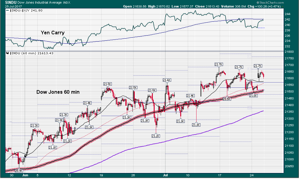
07262017 July 26, 2017
Posted by easterntiger in economic history, economy, financial, markets, oil, stocks.Tags: central banks, China, Economic History, economic theory, f fund, Federal Reserve, oil, QE, S&P 500, stock market index, stocks
add a comment
Current Positions (No Changes)
I(Intl) – exit; S(Small Cap) – exit; C(S&P) –exit
F(bonds) – up to 100%; G (money market) – remainder
======================================================
Weekly Momentum Indicator (WMI) last 4 weeks, thru 07/26/17
(S&P100 compared to exactly 3 weeks before***)
-13.07, +2.39, +18.35, +26.39
With the very slow market action of the past few months, I like to begin each report with a memory refresher to the environment that was in place at the previous report. Let’s look at the TRUE reflection of change since late April, and further.
The S&P500 was UP on it’s open on the 24th, but, only a half-point below Friday’s high. So, why is there so much talk about UP for the year, yet, so little movement in general, and, often for many days at a time?
Here is a chart of the average change, in points for the S&P on top…. . Notice that through all of March, April & May, there was a net negative from March 1st. Total change from March 1st to July 6th was 1%!!

and, for the Russell 2000/S Fund since March 1st.

Even with an S&P500 all-new ‘all-time high’ early Tuesday, the change since March 1represents an average of 1/2 point/day.

The small caps are averaging less than 1/4 point per day…since early DECEMBER!!
And, likewise on the Dow Jones Industrials with SEVEN new all -time highs since June 19th. Yet, averaging the difference between the June 19th all-time high and the July 25th, the latest all-time high, is only 3.25 points per day. So, be very careful of reading too much into the repetitive ‘all-time high’ hype in the financial news. These half-point per day increases won’t compensate you in an average correction, or, after years of just normal inflation adjustments, and, particularly in view of the RISKS that are presented to your portfolios as you WAIT on the next few points.
With this reflection on how ‘easy’ it is, supposedly, to make money in the first half of 2017, it appears that the Wall Street Journal recently noticed something is different this time. Three major stock-market benchmarks in Asia, Europe and the US have avoided pullbacks this year, commonly defined as -5% declines from recent highs.
The last time the S&P500 <SPX> slumped at least 5% was in the aftermath of the June 2016 BREXIT vote — marking a 273-day streak that’s the longest since 1996, according to data compiled by Bloomberg. The last time equity markets went this deep into the year without all three of the global benchmark indexes suffering at least -5% pullbacks was nearly a quarter-century ago, in 1993.
Never in at least the past 30 years have all three indexes – the S&P500, MSCI Europe and MSCI Asia-Pacific ex-Japan–gone a calendar year without falling at some point by at least -5%. In good years and bad, markets tend to fluctuate wildly, with stock indexes often falling by double-digit percentages before bouncing back. That hasn’t been the case this year, another reflection of the historically low volatility that has gripped the world.

The CBOE Volatility Index, or VIX, finished Friday at it’s lowest since 1993. The chart above shows that this years average is the LOWEST IN HISTORY.
It has hit ALL-TIME LOWS every day this week, including a level of 8.84 on Wednesday, 7/26. Extremely low volatility conditions tend to produce very high levels of complacency, and unknown risk, into market participants, who aren’t prepared for the ‘what happened’ moments that approach. Fluctuations in trading volumes are nothing new on Wall Street, but the levels of volatility are the lowest in history. You can view low volatility directly in terms of the 1/4 and 1/2 point average gains on major indexes. You must view extremely low volatility as the ‘calm before the storm’, rather than to greet it with a feeling of comfort or complacency, particularly when they accompany all-time price highs.
Legendary investor Carl Icahn is 150% net short of the market. The net short position means Icahn’s firm is betting against 1.3 shares for every one share it’s betting on. In other words, Icahn’s investment portfolio will generally gain value when prices decline, and vice versa.
86-year-old former Quantum Fund manager George Soros, who retired from fund management in 2011, has come out of retirement, sensing a critical opportunity approaching for major stock declines.
Seth Klaman is CEO & Portfolio Manager of one of the largest hedge funds, the $30b Baupost Group in Boston. He believes that “investors are underestimating risk and the insufficient margin of safety.” His book ‘Margin of Safety’ is a favorite of Wall Street investors. http://www.safalniveshak.com/wp-content/uploads/2013/05/30-Ideas-from-Margin-of-Safety.pdf
Quite clearly, there is substantial risk during these long periods of time, regardless of the overall measure from the election, or, from year-to-date. It is this measure of more risk to reward that keeps me away from equity markets under these conditions. I’ve seen an image of your being given just enough UP, over long periods of time, with the appearance of little downside risk, to guarantee ‘complacency’ in these risky market conditions. DO NOT FALL ASLEEP!
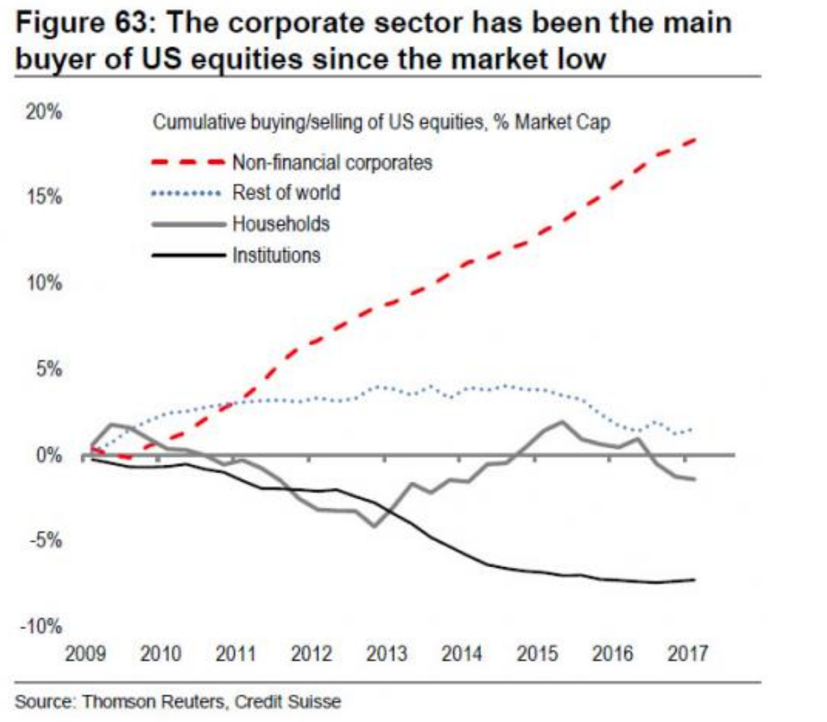
First, institutional cash levels are at multi-year lows. There just isn’t much cash left to put back into the markets to drive them higher.

Secondly, institutional buying is largely offset by proportional selling to lock in profits from share appreciation over the past 6-7 years.
Buying/Holding/Selling on S&P500
Buying/Holding/Selling on NASDAQ 100
Note the prevalence of more selling in the major stocks, last year, with scant buying. They are anticipating lower prices. Most of the buying, driving positive earnings, is as a result of financial engineering accomplished through the result of stock buybacks, since earnings are derived based upon a smaller base of remaining shares outstanding, after the buybacks.
And in what few areas where this momentum is taking place, the appearance of true buying is also deceptive. INSIDERS include corporate officers, executives, board members, etc.
Why are they selling so many more shares than they’re buying????
Apple
Net Insider Selling; P/E Ratio of 17.92 (P/E ratio is share price divided by earnings per share, or by market cap divided by net income; market cap is value of all of the shares totaled together)
Apple has 3 BIG concerns (1) declining gross margins, (2) declining operating margins, and, (3) asset growth is faster than revenue growth.
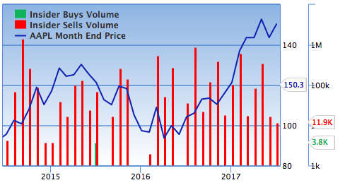
Warren Buffett/Berkshire Hathaway appears to be supporting the market all by themselves. They’re holding 186,716,758 AAPL shares. The next 10 holders only have another 65,617,772 shares, total. Everyone else is reducing, making small buys, or, already sold out. Apple is the #1 company in market cap, over 3 times Visa, or, WalMart, or GE, or, Bank of America.
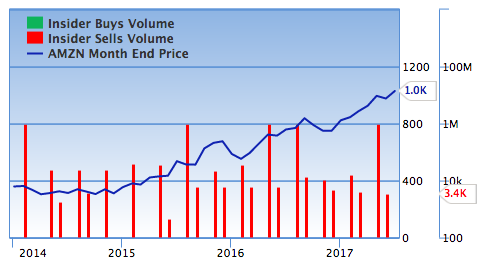
Amazon.com
Net Insider Selling; Shiller P/E Ratio of 197.65!!!
Amazon is also getting less efficient, with asset growth moving faster than revenue growth.
Net Insider Selling; Shiller P/E Ratio of 34.23
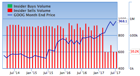
The tech sector has been virtually tilted upward by the flooding of a handful of big-name stocks, which are also represented in the S&P500 to a lesser degree.
According to a FactSet analysis, while there have been massive inflows into ETFs in 2017, the bulk of that money has gone into a vanishingly small part of the industry. The vast majority of funds have been left to essentially fight over the scraps.
The most popular ETF this year, in terms of flows, has been the iShares Core S&P 500 ETF IVV, +0.23% which has taken in $18.51 billion. Two other iShares equity products—the iShares Core MSCI EAFE ETF IEFA, +0.13% and the iShares Core MSCI Emerging Markets ETF IEMG, -0.25% —rounded out the top three, amassing $13.1 billion and $11.3 billion in inflows, respectively.
This trend also held on the fixed-income side, as the iShares iBoxx $ Investment Grade Corporate Bond ETF LQD, -0.59% and the iShares Core U.S. Aggregate Bond ETF AGG, -0.36% topped the list for inflows, taking in a combined $15.1 billion.
It has been widely documented that exchange-traded funds (ETFs) set a torrid asset-gathering pace in the first six months of 2017, with U.S.-listed ETFs hauling in $245 billion in new assets. Fixed income and international equity ETFs were primary drivers of the avalanche of new assets flowing to ETFs.
Year to date, three bond ETFs are among the top 10 asset-gathering ETFs. Those funds are the iShares iBoxx $ Investment Grade Corporate Bond ETF (LQD), the iShares Core U.S. Aggregate Bond ETF (AGG) (a valid proxy for the F fund) and the Vanguard Intermediate-Term Corporate Bond ETF (VCIT). As highlighted by the massive inflows to LQD and VCIT, investors have been searching for higher-yielding though still conservative options for U.S. government debt.
Another prominent theme has been investors’ thirst for ex-U.S. equity funds, which has been stoked in large part by the notion that, with the bull market in U.S. stocks aging by the day, domestic equities are richly valued. “Investors deposited over $20 billion into international ETFs in June and over $80 billion through the first six months of the year – marking the best start to a year ever for international funds,” said SSgA. The roughly 10% surge in the I fund between February and June is reflective of this short-term event. This parallels the +3.29%/+5.25%/+6.6%/8.2% increases in the French CAC, British FTSE, German DAX, and Swiss market indexes, respectively, year-to-date.
How else do we reconcile so much of the bullish news on ‘strong earnings’ on the S&P500?
First, almost half of the earnings for the S&P500 come from just one sector, energy!!


While the S&P 500 earnings outlook looks impressive mainly due to a bounced-back energy sector, technology and financial services look impressive as well. But they depend on energy, too.
If oil prices fall enough to hurt the energy sector, some producers will miss loan payments. That would be bad news for the lenders in the financial-services sector.
Likewise, energy companies won’t buy as much hardware and software if they have to cut back on drilling activity. Not good for some technology companies.
Bottom line: the bull market in US stocks will be on even shakier ground if oil prices dip below $40 again. In any case, earnings growth probably won’t continue at current rates unless oil prices climb higher.
The FED
Fed Chair Janet Yellen said just this month that the Fed will be kicking the dollar ($USD) off a cliff.

She didn’t use those words, but the words she did use weren’t all that different.
But first a little context…
The fact is that the $USD has been falling steadily throughout 2017. At this time of this writing, it was down nearly 8.5% year to date. (The dollar should be ‘strengthening’ during rate increases, not falling. There is no confidence in the Fed’s moves to tighten monetary policy.)
The International Monetary Fund (IMF) just issued a warning, reflecting the weakness of the dollar to other currencies. The IMF also noted that “the U.S. Dollar has depreciated by around 3½ percent in real effective terms since March,” while the Euro was strengthened. Countries such as Germany, France, Italy and Spain all saw growth projections increase. China’s growth was expected to stay at 6.7%. They also placed uncertainty in U. S. political leadership as one of their criteria for their warning.
“The major factor behind the growth revision, especially for 2018, is the assumption that fiscal policy will be less expansionary than previously assumed, given the uncertainty about the timing and nature of U.S. fiscal policy changes.”

The four largest central banks now have a total of THIRTEEN TRILLION dollars on their balance sheets, nearly TRIPLE their balances from the bottoms of the last financial crisis in 2009. Anyone who has believed during the past 8 years that our markets are on strong financial footing, worthy of full confidence and bullish appetites, is sadly out of touch with the reality of the TEMPORARY magic of electronically created money.
THERE IS NO FREE LUNCH!
THE PARTY IS NEARLY OVER!!
IT CARRIES INTEREST PENALTIES!!!
IT RESTRAINS GROWTH!!!!
THIS MONEY MUST BE WITHDRAWN!!!!!
In a Fed statement in early July, the following stunning statement was issued.
In the assessment of a few participants, equity prices were high when judged against standard valuation measures.
That is an incredible statement.
It tells us:
1) The Fed is openly discussing stocks prices.
2) The Fed is openly discussing whether stocks are in a bubble (when prices are high against standard valuations).
3) MORE THAN ONE Fed member believes that stocks ARE in a bubble.
On June 27th, ECB President Mario Draghi raised the possibility of reducing their 2-year quantitative easing support, totaling €60 billion/month, before the end of the year. An Q2 annualized 3% growth rate in the Eurozone gives Draghi the room to take his foot off the pedal. This was the fastest pace in a decade. Of the €4.25 billion on the ECB balance sheet, €2.25 billion have been added since March ’15. Most of this liquidity was channeled into the high-flying NASDAQ, led by Facebook, Apple(!), Amazon, Netflix, Google, and Microsoft, as well as Alibaba and Tencent pushing the Hang Seng index to a recent 2-year high, and pushing Samsung in Korea. With this combination from the ECB, the Japan Central Bank, as well as the Swiss National Bank, the NASDAQ has doubled in value from the post-Brexit lows in June ’15, in the face of 3 Fed rate hikes, and threats to reduce the access to liquidity by reducing the $4.5 trillion balance sheet. A clearer signal on the ECB’s plans will emerge when Draghi addresses the Jackson Hole, Wyoming financial summit in late August.
Central Bankers are absolutely terrified.
In the last month, both Fed President Janet Yellen and ECB President Mario Draghi have issued somewhat hawkish statements, only to turn around within 48 hours and walk back their comments.


Where has this nearly decade-long Fed support to the market left Main Street?
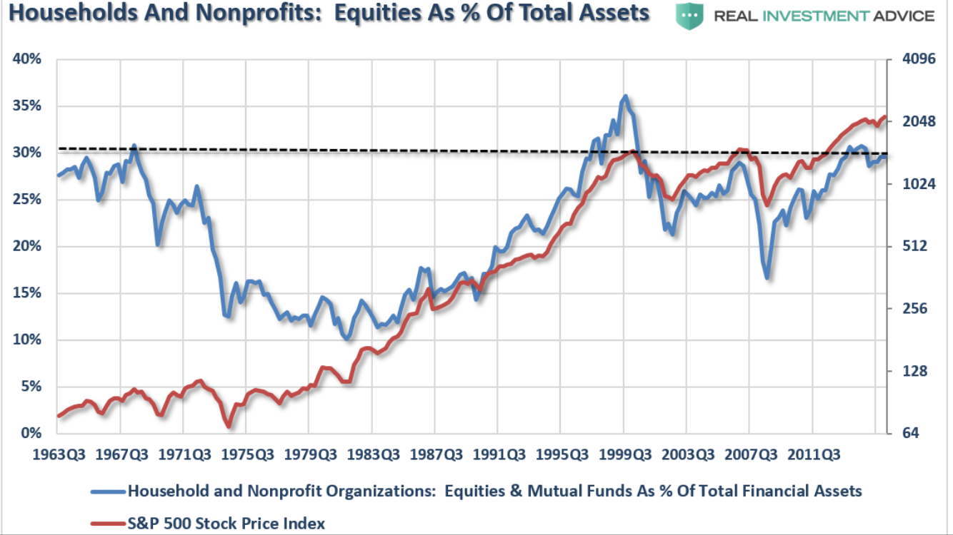
Study shows 1/3 of Americans not recovered from Great Recession. #Fed? Still ok. After all, equity averages up > 3 times since March 2009.
However, even Main Street is exhausted.
Notice how this chart shows market peaks, shown by the S&P 500 index on the right, at nearly the same times that household percentage of ownership reaches historical peaks, shown on the left. We are now at 30%, slightly higher than the previous market top in 2007, and just about 6% under the tech bubble peak in 1999/2000.
Stocks look expensive by multiple measures, and they have for a while now. But that hasn’t stopped major indices from achieving new highs as market fundamentals have looked more than capable of withstanding higher prices.
That all could change as the stock market swells to a size rarely seen outside of 2000 and 2008, just before the two most recent stock market crashes, says Deutsche Bank.
Rather than assessing the stock market using more traditional methods such as price-to-earnings ratio, Deutsche is instead looking at equity market cap as a percentage of gross domestic product (GDP). And it attributes the recent rise in historical highs to a shift in monetary policy.
While global markets benefited from a “long period of post-global financial crisis accommodation,” that’s changing as central banks like the Federal Reserve move to tighten.
It’s also important to note that Deutsche’s measure of market cap as a percentage of GDP also spiked to current levels in 2015, yet the market didn’t become embroiled in a crisis. This is because the Fed didn’t tighten to the degree that was expected, waiting until December of that year to increase rates, and then waiting another full year to hike again.
The situation showed that swift central bank tightening is a key component to unwinding an equity bull market. And this time around, stock bulls may not be so fortunate, with the Fed signaling a clear path of rate increase after already hiking multiple times.
THE CURRENT US TOTAL MARKET/GBP RATIO is 135.3%. This is closer to the historical maximum than in any other industrialized nation right now.

This projects future returns that among the lowest in the world.

And it’s not just US stocks seeing their market cap swell as a percentage of GDP — Japan and the UK are getting in on the action, showing its a worldwide phenomenon.

This is a very uncomfortable global picture. It’s similar to that of a number of pressure cookers all running at once, all inter-connected. They must all function properly, or, they’ll all ripple their problems from one to the other.
04222017 April 22, 2017
Posted by easterntiger in economic history, economy, financial, markets, stocks.Tags: bonds, central banks, Economic Cycles, economic theory, f fund, Federal Open Market Operations, Financial Trends, interest rates, Markets, momentum indicator, QE, S&P 500, stock market index
add a comment
Current Positions (No Changes)
I(Intl) – exit; S(Small Cap) – exit; C(S&P) –exit
F(bonds) – up to 100%; G (money market) – remainder
======================================================
Weekly Momentum Indicator (WMI) last 4 weeks, thru 04/21/17
(S&P100 compared to exactly 3 weeks before***)
-11.3, -3.43, -6.54, -1.94
Partial recap of my interim report of 4/19 – Stocks have given up much of their gains built on the ‘hopes’ of health care reform, tax reform, relief in regulations, or, any of the political promises that fueled one more fluff-filled rally. Optimism was enough to create this last opportunity. It is not enough to sustain, or, incur any reasonable risk.
Four days later, from CNBC – Stocks surged as talk out of Washington pointed to the potential for some action on health care, which is viewed as a precursor to any move forward on tax reform. Treasury Secretary Steve Mnuchin also said Thursday that progress is being made on tax reform. President Donald Trump said he was hopeful there would be a vote on health care next week and also to fund the government.
With virtually no gains for over 2 months, rhetoric such as the above keeps markets stuck in a perpetual, dream-filled loop to nowhere.
The chart below shows the wasted motion currently underway.

That MSCI World Index is a broad global equity benchmark that represents large and mid-cap equity performance across 23 developed markets countries. It covers approximately 85% of the free float-adjusted market capitalization in each country and MSCI World benchmark does not offer exposure to emerging markets.
Otherwise, and with all due respect to the advances from Election Day into February, it’s worthy to note that pre-Election Day price levels were flat to down for most of the previous 18 months; from March ‘15 to November ‘16, C Fund 44 to 45, F Fund 51 to 49, I Fund 61 to 56. Early in February, several days of the bulk of February gains resulted from comments from administration officials giving hints of a tax cut.
Any news on (1) health care reform, or (2) tax reform, or (3) tax cut, or (4) infrastructure = automatic stock rally; a rally that might or might not remain several weeks later. (‘tax cut’ in the news on 4/21 – index prices moved slightly upward immediately, though, it reversed within minutes. There were two such occasions in early February that created the same ‘sugar high’ for the markets.)
Billionaire investor Paul Tudor Jones has a message for Janet Yellen and investors: Be very afraid.
The legendary macro trader says that years of low interest rates have bloated stock valuations to a level not seen since 2000, right before the Nasdaq tumbled 75 percent over two-plus years. That measure — the value of the stock market relative to the size of the economy — should be “terrifying” to a central banker, Jones said earlier this month at a closed-door Goldman Sachs Asset Management conference, according to people who heard him.
 This chart shows the S&P 500 with respect to the size of total economic activity, GDP.
The market is expensive! A week ago, I mentioned the 28.8 price-to-earnings ratio, which is 73% higher than the 100 year average. This expense projects a future return in the very low single digits over the next ten years.
The 500 companies in the S&P500 can be divided into 11 sectors.
Each sector contains different number of companies.
Within this current 29.1 P/E, as of 4/21, the individual S&P sectors are shown as follows:
Sector Number of Stocks Shiller P/E Regular P/E
Energy 35 17.40 -41.80**
Consumer Defensive 41 23.30 19.20
Financial Services 70 23.70 16.00
Industrials 70 23.90 21.50
Utilities 28 25.00 34.20
Healthcare 59 27.40 20.60
Basic Materials 23 27.70 35.60
Consumer Cyclical 85 28.20 21.90
Technology 60 30.80 24.10
Communication Services 9 31.20 20.80
Real Estate 24 47.80 22.70
S&P 500 500 29.10 26.40
** – negative price-to-earnings in the energy sector are due to significant losses in coal, oil & gas exploration, integrated oil & gas, gas & oil storage, as a result of oil prices remaining below the break-even points for many companies in the sector. This is also evidence of the flaws in ‘regular’ p/e ratios, versus the Shiller p/e’s.
Meanwhile….a short-term underlying technical picture is absolutely unchanged through this week, and is decidedly negative. For eight days in a row, many major averages have hovered UNDER a line of resistance, a ceiling, at the 50 day moving average.
Friday’s S&P500 level is actually 15 points lower than the February 21st level of 2366!
Last September, the C fund lost 4% within 7 weeks after breaking below the 50 day moving average.
Similar patterns show up in the F and I funds.
S fund’s 50 day moving average is 57.08.
I fund’s 20 day moving average is 62.03, as it nears the 50 day average at 61.36.
The more consecutive closes below these key averages, the more negative the near-term technical picture.
F fund performance relative to C fund

F fund performance relative to S fund
F fund performance relative to I fund
The F fund is poised to outperform C, S and I funds, with (1) the topping of the equity markets in early March, corresponding to (2) the topping in interest rates early in the year, a perfect, normally correlated occurrence.
On the liquidity front, this month the Fed added $23.4 billion in cash to Primary Dealer Trading Accounts in the period April 12-20. This is slightly more than the March addition of $21.9 billion, the smallest add since January 2016. It was a sharp decline from February’s $41.6 billion. These levels are far below the QE levels of a few years ago. What’s different this time? That QE support, that ended in 2014, was NOT withdrawn the next month, as is the support from mortgage backed securities!!!!
In the past 18 months, there have been several periods that tied or exceeded 20-30 year records in the number of days where major stock averages did not exceed 1% up or down for a number of days in a row. This shows a lack of conviction on the part of both buyers, AND sellers. Potential buyers are waiting on lower prices. Potential sellers are waiting on higher prices. In either case, no one wants to be first, to get in OR out. The latest report on borrowing to buy stocks (margin debt) has just hit another high. Those borrowers might believe that it’s a good idea. They won’t believe so later, if their gains don’t meet their expectations, forcing them to sell sooner than expected, and, possibly, under pressure to do so. If this happens, you’ll know!!
So, as you thought that the Fed ended QE in late 2014, and it did, the Fed has continued to add cash to the financial markets every month. It does so via the purchases of mortgage backed securities (MBS). It calls them “replacement purchases.” The Fed is the bank for the banks, i.e. the central bank. It has resolved since 2009 to force trillions in excess cash into the banking system and making sure that that, somehow, some additional money flows through the system. It has also resolved to make sure that the amount of the cash in the system does not shrink. It does that each month via its program of MBS replacement purchases. The Primary Dealers* are selected by the Fed for the privilege of trading directly with the Fed in the execution of monetary policy. This is essentially the only means by which monetary policy is transmitted directly to the securities markets, and then indirectly into the US and world economies. The only means which the Fed uses in the transmission and execution of monetary policy is via securities trades with the Primary Dealers. Yes! The Fed is still providing some degree of artificial support to the markets. It’s just not to the same degree as before the expiration of quantitative easing (QE).
- List of current primary dealers – Bank of Nova Scotia, New York Agency, BMO Capital Markets Corp., BNP Paribas Securities Corp., Barclays Capital Inc., Cantor Fitzgerald & Co., Citigroup Global Markets Inc.,Credit Suisse Securities (USA) LLC , Daiwa Capital Markets America Inc., Deutsche Bank Securities Inc., Goldman, Sachs & Co., HSBC Securities (USA) Inc., Jefferies LLC, J.P. Morgan Securities LLC, Merrill Lynch, Pierce, Fenner & Smith Incorporated, Mizuho Securities USA LLC, Morgan Stanley & Co. LLC, Nomura Securities International, Inc., RBC Capital Markets, LLC, RBS Securities Inc., Societe Generale, New York Branch, TD Securities (USA) LLC, UBS Securities LLC., Wells Fargo Securities, LLC
When the Fed buys MBS to replace those paid down from its balance sheet, it does so via trades with Primary Dealers. It buys MBS via forward purchase contracts which are typically settled in the next month or the following month. The Fed is only keeping the amount of its assets level. But it pumps billions in cash into the accounts of Primary Dealers each month as part of that process.
The dealers are in the business making markets in a broad spectrum of securities, including MBS. Their biggest customer is the Fed. When the Fed cashes out the dealers by purchasing MBS from them, the dealers can both leverage and redeploy that cash to not only buy more MBS, but to purchase whatever other securities it wants to. Stocks are a favored vehicle. The Fed cashes out the dealers when it settles the MBS purchases around the third week of the month each month. Even though the amount of cash in the system is roughly static, the Fed is still pumping cash into Primary Dealer accounts each month. That has an impact on the stock market. It’s obviously not the only impact, but it’s still part of the central bank game of rigging the market.
This chart of the combination of all of the Fed feeding since 2009, and even beyond the quantitative easing (QE), although it ended in 2014, continues, in reduced effect, through monthly purchasing of mortgage backed securities, providing trading revenues to participating banks.

Notice that from the end of QE, in late 2014, and on to late 2016, market levels were insignificantly higher overall. This ‘juicing’, only within the past 5 months (post-election) was on the ‘hopes’ I mentioned in the interim report, based upon prospects for health care reform, tax reform, etc., that, realistically, won’t have the market impact that is was already anticipated. Almost none of these elements are going to address the ‘greed’ factor that’s already been cranked into markets over the past few years, to get them to current levels.
With mortgage rates coming off the highs, there could be a slight increase in refi activity. That causes an increase in MBS paydowns, which the Fed will replace in the next month. Then it takes another month or two for those purchases to settle. There is a lag of 5-6 months between the drop in mortgage rates and the increase in the settlement of the Fed’s replacement purchases. By then the Fed may have begun to implement its proposed policy of “normalizing” the balance sheet. That’s a nice way of saying “shrinking” the balance sheet. To do that the Fed is proposing to allow its Treasury holdings to mature and not be rolled over. It’s also proposing not replacing MBS as they are paid down. So instead of a small addition to the Fed’s MBS purchases from the Primary Dealers a few months down the road, the Fed will indirectly withdraw money from the banking system and the markets. By doing it slowly over several years, the Fed may be able to avoid crashing the market. I use the word “may” purposely. Any shrinkage of the Fed’s assets will increase the odds of an accident. Slow and steady tightening will act like the drip, drip, of the old Chinese water torture. It will promulgate a bear market in stocks. Accidents do tend to happen in bear markets. The drip, drip, drip eventually turns into a cascade.
Most interesting, the Fed minutes last week also showed that Fed officials were discussing what to do with the central bank’s massive $4.5-trillion balance sheet, which was quadrupled during the financial crisis and its aftermath as the Fed engaged in three rounds of bond purchases as a way to depress long-term interest rates and give the stock market a boost. The minutes said that Fed officials agreed “a change in the committee’s reinvestment policy would likely be appropriate later this year.” Currently, the Fed has been keeping the level of the balance sheet steady at $4.5 trillion, by re-investing 100% of maturing debt.
It has been held for years that we’ll know the Fed is serious about tightening when it starts shrinking the balance sheet. Right now they are in the signaling stage. They’re talking about it. When the Fed talks about an idea, it eventually gets around to doing it. The Street is already telling you it will be no big deal. Don’t believe it. It’s time to ‘sell’ the stock rallies. Not everyone will get the message in time.
Will the Fed Burst the Bubble in 2017?
The Fed has engineered the second longest Bull market in Wall Street’s history. It’s been dubbed the “Least Loved” Bull, because the US-economy’s recovery from the Great Recession has been the weakest since the 1930’s averaging only +2% growth per year. Still, the rising market for US-stocks, turned eight years old on March 9th, and might have finally silenced the critics in the “Doom and Gloom” business, who doubted its staying power. From a statistical perspective, this market’s no slouch. It has posted big enough returns to rank #4 all-time in terms of performance, with the mega-Bull run from the 1990’s taking top honors with a gain of +417%, according to S&P Dow Jones Indices. The current market can’t be faulted for a lack of endurance, either, as only one Bull has lasted longer. It has also generated more than $21-trillion in new stock market wealth. ALWAYS keep in mind that these ‘returns’, always measured from the March ‘09 bottom, are measured from a point of a 12-year low, where all of the gains from 1997 to 2009 were wiped out. Any triple-digit gains for the past 8 years also apply from 1997 to today. That places averages for this 20-year period right back in the range of long-term norms. There are no free lunches. You only get returns with time, or, with higher than average risk, in the absence of sufficient time.
The best-performing group for the past eight years was the consumer discretionary sector, which includes home improvement retailer Home Depot, coffee shop Starbucks and athletic apparel and sneaker giant Nike, has benefited from an improving economy and people’s willingness to buy things not deemed necessities. The S&P-500 index has rallied +250% since hitting a closing low of 676.53 on March 9th, 2009. The gains since, uninterrupted by a decline of -20% or more, rank this bull market as the second longest ever. The S&P continued to rally through a five quarter long recession in corporate earnings through most of 2016, supported in part by historically low interest rates which made stocks comparatively cheaper and more rewarding than high grade bond yields. The “Least Loved” Bull market is nearly three years older than the average Bull, and is more than a year shorter than the longest one: the rally from October 11th, 1990 to March 24th, 2000.
However, this Bull market isn’t only the second oldest, it’s also the second-most expensive. On a trailing 12-month basis, using Q’4 2016 GAAP earnings per share, the S&P 500’s price-to-earnings ratio stands at 25x, -second only to the 30-times earnings multiple recorded at the end of the tech bubble in 2000. (The range was also into the high 20’s surrounding the Great Crash of 1929. We’ve left that out, since it predates everyone reading this.) Investors, however, are encouraged by a projected +11% rise in 2017 operating-earnings per share and think the growth could be even stronger if the Trump administration successfully delivers on promised tax cuts and increased infrastructure spending. Others see the potential for a final “melt-up” that could mark the top. Share prices could shoot up sharply if retail investors get jazzed about stocks again and start “pouring” money into the market. The melt-up may have already started, or finished on March 1st (the current high), on expectations that Trump’s tax reform will significantly cut taxes for both corporations and individuals. The stock index hasn’t suffered a drop of -20% since the Great Recession Bear, which ended on March 9, 2009. But the broad market gauge is up more than +250% since. There is no doubt that when the SPX is up +250%, with mid-single-digit sales growth, that it is a liquidity driven market. Then again, liquidity is one of the five cornerstones of the investing process, along with valuations, fundamentals, technicals and fund flows. This is clearly not going to last indefinitely, but the conditions for a Bear market – a decline of -20%, are only in place WHEN the Fed drains liquidity to the extent that it causes an economic recession (more on that below). Whether we like the interventions or not, for markets, the Fed matters. It has always mattered.

Indeed, if one left it at that, the answer would not be exactly wrong. However, there is one more factor which is rarely discussed, and which – according to Deutsche Bank – virtually the entire equity rally of the past four years is the result of plunging bond yields, which as a reminder, is the direct pathway by which central banks operate. As Deutsche Bank’s analysts warn, “various Fed officials have raised the issue of financial stability in the context of the reach for yield and riskier products to make up for low rates. This is part of financial repression. The logic might be that once the Fed has normalized, elements of that reach for yield and risk would be unwound and this could lead to disruptive financial market volatility.” Put in the simplest possible word, this means the Fed is worried that once rates go up as a result of renormalization and the lack of a central bank to front-run, stocks will crash. As it turns out the Fed has ample reason to be worried. Because QE and the Fed’s Zero Interest Rate Policy or financial repression is responsible for 92% of the S&P-500 rally since it launched QE-2 in Nov 2012, or just over +800-points, that would suggest that the Fed super-easy money policies are directly responsible for approximately 25% of the “value” in the market, and any moves to undo this support could result in crash. In retrospect, it becomes obvious why the Fed is petrified about even the smallest, +25-bps rate hike. The problem is an irredeemably flawed monetary doctrine that tracks every tick in the S&P-500 index, and uses financial repression, or artificially low interest rates and bond yields were the principal mechanism whereby wealth is transferred from savers to the US-government and shareholders in the US-stock markets.
Stock traders have been under the spell of monetary easing” to the point where negative news such as downbeat US jobs data in March did not stop stock prices from going up. Traders shrugged off uncertainty because they expect any bad news to be followed by continued low interest rates or bond purchases that increase the supply of money in the economy. Yet again, massive credit-fueled capital misallocation simply papers over short-term cracks and extends the life of the economy’s expansion cycle, but leaves a bigger more damaging hangover of credit defaults in its wake, unless just a little more credit fueled zombification will help. Many traders don’t expect the Fed to normalize its interest rates or reduce the size of its bond portfolio in any meaningful way, and the feeling is that we’re OK for a while, and everyone thinks they’re smart enough to know when the music is going to stop.
Many investors are bullish on stocks in the ninth year of a rally. Earnings will improve with future tax cuts and the liquidity spigot is still wide open, so it’s like a giant game of musical chairs. The attitude on the part of most investors is that they have to play while the Fed got the music going.
The Fed’s bombshell announcement; “a change in reinvestment policy would likely be appropriate later this year,” from the minutes of the Fed’s discussion at their March Meeting released Wednesday, showed near-unanimous support for the +25-bps rate hike to 0.875%, the second rate hike in three months. The group decided to keep signaling that future rate hikes would be gradual, and futures traders are giving 60% odds of a +25-bps rate hike to 1.125% at the June meeting. Traders are split on the likelihood of a rate hike to 1.375% by year’s end, with the Dec ’17 contract priced at an implied yield of 1.25%, or a 50% chance. The Fed has a major credibility flaw and traders are skeptical of their hawkish rhetoric.
Not so coincidentally, as the Fed Fund rate has been increasing, mortgage rates are falling. Why is that? While increasing the Fed Funds rate makes it more expensive for the banks to borrow from the Fed, mortgage rates are based on the 10-year Treasury Note, which has been weakening since it’s peak in December and March. The 10-year Treasury Note is more responsive to changes in the dollar, and to global rate concerns.
Final Note
There’s always a possibility of unexpected, but, related, outside negative influence that can always act to disrupt even the most carefully positioned scenarios.
The Shanghai index has been locked in a tight range, also pretending to project a stable financial environment. This has been accomplished with some degree of force, using involuntary means to prevent selling. It has even been illegal to sell stocks under some conditions.
In the event that the support range currently in play doesn’t hold, it could result in a wave of forced selling that could destabilize our markets as well. I’ll be watching for any echoes that come in our direction.

Weather Report – Interim – 04162017 April 15, 2017
Posted by easterntiger in economic history, economy, markets, stocks.Tags: bonds, Economic Cycles, economy, f fund, interest rates, S&P 500, stocks, treasury note
add a comment
Current Positions (Changes)
I(Intl) – exit; S(Small Cap) – exit; C(S&P) –exit
F(bonds) – up to 100%; G (money market) – remainder
======================================================
Weekly Momentum Indicator (WMI) last 4 weeks, thru 04/14/17
(S&P100 compared to exactly 3 weeks before***)
-3.43, -6.54, -1.94, -13.7
The absence in creating or changing positions since the election can be summed up by these two headlines, nearly five months apart.
November 9, 2016
There’s hope for the market under Trump
…..hope….
March 21, 2017
Stocks Plunge, Trump Trade Dies, Fed ‘Doesn’t Care’
….back to reality….
Technically, bonds are regaining strength, reversing the previous trends in interest rates.
Stocks have given up much of their gains built on the ‘hopes’ of healthcare reform, tax reform, relief in regulations, or, any of the political promises that fueled one more fluff-filled rally. Optimism was enough to create this last opportunity. It is not enough to sustain, or, incur any reasonable risk.
We know the prices, and the returns. How do we evaluate the risks that come with appreciation?
Prof. Robert Shiller of Yale University invented the Schiller P/E to measure the market’s valuation. The Schiller P/E is a more reasonable market valuation indicator than the P/E ratio because it eliminates fluctuation of the ratio caused by the variation of profit margins during business cycles. This is similar to market valuation based on the ratio of total market cap over GDP, where the variation of profit margins does not play a role either.

At the market peak on March 1st, the S&P500 reached 2400. At that point, this ratio was at 29.5. The S&P500 is now at 2328.95, as of the close on Thursday, April 13th. This places the current ratio at 28.8, or 71% higher than the historical mean of 16.8. We are in the third most expensive market of the past 100 years!!!
There is simply no way to justify holding comfortable positions in U.S. equities at this point.
I will elaborate on these points in the next few days.
All of the pieces are in place for what appears to be a ‘final top’, or, at the very least, an extended, risk-filled churn to an insignificant new high, with an equal chance for measurable losses in the near-to-medium term.


